ControlBar Builder
Description
The ControlBar Builder is used to define a ControlBar control.
Introduction
Finding the ControlBar Builder
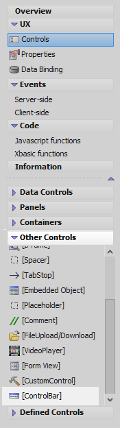
In the UX Builder on the Controls page open the 'Other Controls' menu and click on the [ControlBar] option to add a ControlBar control to the UX.
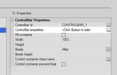
Highlight the ControlBar control in the tree. In the properties list under 'ControlBar Properties' click on the ControlBar properties property. Alternatively double click on the [ControlBar] control itself.
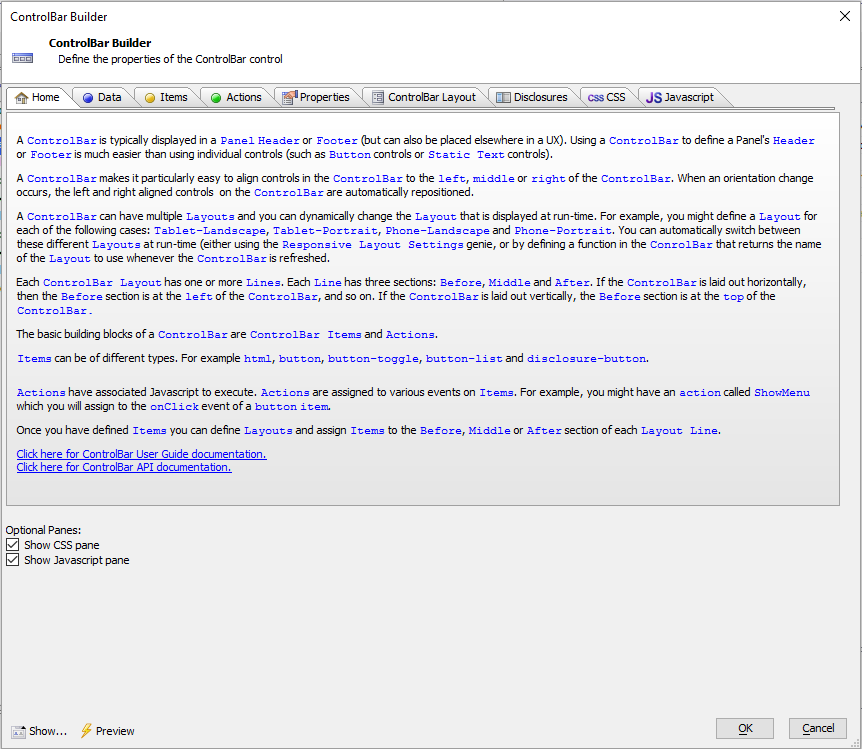
The ControlBar builder will open.
ControlBar Panes
The ControlBar Builder contains the following panes.
- Home
Gives a general overview of the ControlBar builder
- Data
The data pane is used to define ControlBar data.
- Items
The Items pane allows developers to define items such as buttons, button-lists, and button-toggles.
- Actions
The Actions pane allows you to define 'actions', i.e. bits of javascript, that are tied to items.
- Properties
The 'Properties' pane contains a number of settings. Among these are settings to define Javascript events for the ControlBar, specify animation times, and set docking preferences.
- ControlBar Layout
This pane is where the visual appearance of the ControlBar is defined.
- Disclosures
Optional. This pane defines disclosures. Disclosures are similar to pop-up windows.
- CSS
Optional. The CSS pane can be used to define custom CSS to use with the ControlBar.
- Javascript
Optional. The Javascript pane can be used to used by the ControlBar.
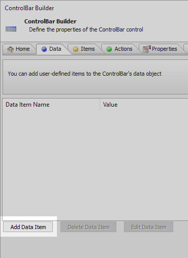
Data
Adding Data
In the Control Bar Builder open the Data pane
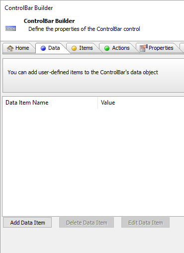
Click the 'Add Data Item' button.
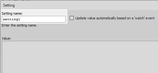
A dialog named 'Setting' will open. In the 'Setting name' textbox give the item a name, like 'setting1'.
In the 'Value' text area give the named item a value. Click OK
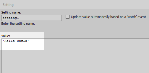 The value can be in the form of a string, a JSON object, or a function that returns a value.
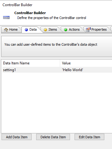
The new value should appear in the Data pane.
Defining Data
The Data pane allows you to define ControlBar data. You can define as many data items as you want. Each data time has a unique name and a value. The value can be a string, a JSON object, or a function that returns a value. For example
setting1 = 'value of setting 1'
setting2 = {address: '123 main st.', city: 'boston'}
In the second example the data item's value is a JSON object. To refer to one of the properties in the object you use the full path. For example:
setting2.city
The primary purpose (although by no means their only purpose) is to provide content to be displayed on the ControlBar, or to be used in Enable/Disable expressions for controls that are placed on the ControlBar. For example, you might have an HTML ControlBar item whose html text is set to:
{setting1}A powerful option when defining Data items is to specify that the value of the data item should be updated automatically when a 'watch' event fires. When you define a watch event you can specify which controls you want to watch. For example, if you specify that you want to watch the FIRSTNAME and LASTNAME controls, then whenever the value in one of these controls changes, the watch event will fire.
Watch events also fire when the state of the UX changes. For example, when the UX goes from a 'clean' state to a 'dirty' state.
You can also manually fire watch events using this method:
{dialog.Object}.refreshClientSideComputations([flagSynchronous]);To specify that a data item should be updated automatically when a 'watch' event fires, click the checkbox on the above dialog. The dialog will change to this:
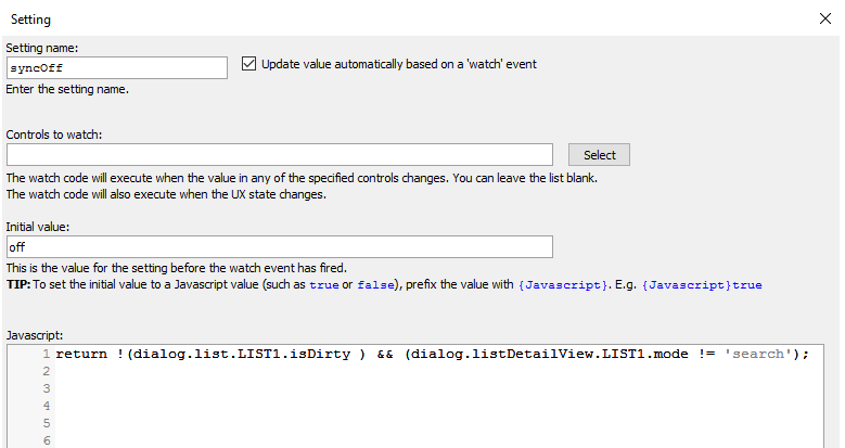
You can specify which controls you want to watch. You can leave this blank if you only want the watch event to fire when the UX state changes or when watch events are manually fired. You can also specify the initial value of the data item. This is the value that the data item will have before the watch event fires the first time. In the Javascript section you define the code that runs when the watch event fires. Your code must return a value. This is the value that the data item will be set to.
Items
Defining Items
The Items pane is where you define the ControlBar's items. Items are the 'objects' that you place on the ControlBar layouts. There several different types of ControlBar items.These are: html, button, button-toggle, button-list and button-disclosure.
HTML ControlBar Item
Button ControlBar Item
The standard display types for a button are available. These are:
Text only
Image only
Text followed by Image
Image followed by text
Image above text
Text above image
Button-Toggle ControlBar Item
Button-toggle items can be defined as two-state, or multi-state. If two-state, then each click toggles between the button's true and false states. If multi-state, each click switches to the button's next state.
Button-List ControlBar Item
Here is the Data definition that would be automatically added to the ControlBar's data for the above button-list button definition:
"myButtonList": {
 "value": [],
 "data": [
 {"html": "Button1","icon": "svgIcon=#alpha-icon-calendarWeek:icon,24","value": "1"},
 {"html": "Button2","icon": "svgIcon=#alpha-icon-cart:icon,24","value": "2"},
 {"html": "Button3","icon": "svgIcon=#alpha-icon-chartBar:icon,24","value": "3"}
 ]
 }
If you prefer to add the above data structure to the ControlBar data yourself (on the Data tab of the builder), then you can point the button-list to use your hand-coded button-list definition by selecting the Point to existing definition in ControlBar data property in the builder.
A common pattern when using a button-list on a ControlBar is to use icons for each button and spread out the buttons so that they fill the width of the screen, as shown in the image below (in a vertical ControlBar, the buttons would fill the height of the screen).
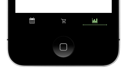
To achieve this look the Fill width property is checked.

Actions
The Actions pane is where you define the ControlBar's actions. Actions are simply named snippets of Javascript. Once you have defined an action, you can assign the action to an event on a ControlBar item.
Properties
The ControlBar builder allows you to set several properties as shown in the image below:
Layouts
The ControlBar Layout pane is where you design the visual appearance of the ControlBar. The Layout pane is shown in the image below. A ControlBar can contain multiple layouts and you can dynamically select which Layout to use at run-time. The ControlBar Layout pane also includes a preview of the Layout design. You can change the edge for the Layout so you can easily see how the Layout would render in either horizontal or vertical mode. You can also adjust the size of the Layout so you can easily see how (for example) the ControlBar would render on a Phone or a Tablet. Each ControlBar Layout can have one or more 'Lines'. Each 'line' is divided into three sections: Before, Middle and After. You add ControlBar items to any of the sections on a Line.
Disclosures
Disclosures are like pop-up windows that are displayed when a disclosure-button is clicked. You can either specify some explicit HTML to be shown as the disclosure, you can specify that a ControlBar Layout should be shown. The Disclosure pane in the ControlBar builder (shown in the image below) is used to define Disclosures that display explicitly defined HTML.
When you want to display standard UX controls (such as input controls, Lists, buttons, ViewBoxes, etc.) in a disclosure, you define a new disclosure on the Disclosure pane and then, when defining the HTML for the disclosure, you can add the contents of a InjectibleContent container to the disclosure. See below for more details.
Videos
Introduction to Basic Concepts
This video demonstrates basic concepts of the ControlBar control.
Updating ControlBar Data - Dynamic Text
This video demonstrates how you can update the data in the ControlBar's data. This allows you to put dynamic text in the ControlBar. We also show how the ControlBar can be animated when it is refreshed.
Using Watch Events to Update ControlBar Data
The ControlBar data can be updated automatically in response to certain events in the UX (such as the UX going dirty, a List going dirty, etc.) or by a change in the value of one or more controls.
In this video we show how you can configure watch events to automatically update ControlBar data.
Adding a Button to a ControlBar
In this video we show how you can add a button to a ControlBar and then associate an action (i.e. some Javascript code) to run when the button is tapped.
Adding a Button-Toggle to a ControlBar
In this video we show how you can add a Button-Toggle to a ControlBar. Toggle buttons can either be two-state (switching between a true and a false state), or multi-state (each click advances to the next button state).
The video shows how the state of a Button-Toggle is used to control what action a button performs when clicked.
Adding a Button-List to a ControlBar
A common pattern in mobile apps is to have a button bar at the bottom of the screen with a series of buttons that allow you to select the active Panel that is shown on the device. Typically, these buttons are spread out so that they fill the width of the screen. The button-list control is ideal for implementing this pattern.
In this video we show how a Button-List can be configured to fill the width of the screen and to select a Panel Card in a Panel Layout when one of the buttons in the Button-List is tapped.
Selecting the Active ControlBar Layout
A ControlBar can have multiple Layouts. In this video we show how you can dynamically select the Layout to show.
Showing a Disclosure
A disclosure can be some explicitly defined HTML, or it can be another Layout. In this video we show how a disclosure, defined as a ControlBar layout, is shown.
We also explain the Outside-After and Outside-Before disclosure types and demonstrate how the Outside-After type is rendered.
Showing a List in a Disclosure
You can display standard UX controls (such as Lists, Buttons, Input controls, etc.) in a disclosure. In this video we show how a list is displayed in a disclosure.
Setting the Selected Button in a Button List using Javascript
The selected button(s) in a ControlBar Button List can be set programmatically using Javascript. It is also possible to completely change the buttons shown in a Button List programmatically.
In this video we show how this is done.